
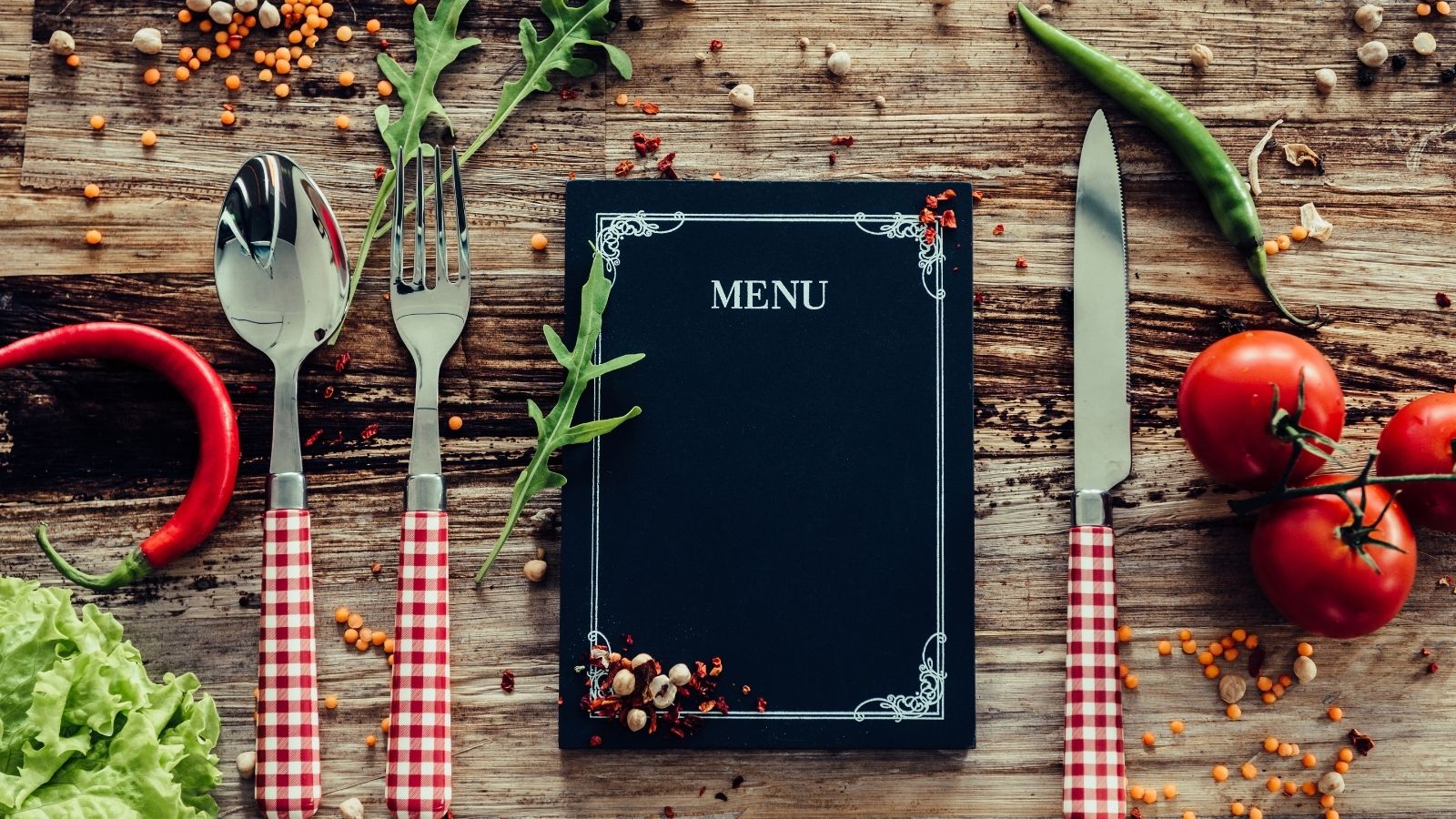
Your menu is much more than a simple list of food items. Through your design choices, your menu can become a key part of your marketing materials. Let’s look at some specific ways that you can approach your restaurant menu design to make it as powerful as it can be.
The Power of Your Menu
Your menu is one of the first things that people see in your restaurant. They may even look it up online to help them decide whether to visit your restaurant.
And depending on its design, it has the power to get people excited about your food — but it also has equal power to overwhelm or confuse them.
The power is completely in your hands. Depending on the fonts, colors, and other design elements you choose to use, you can set the scene for your restaurant. It might be casual and playful or present a more elegant feel.
It’s amazing how versatile one item can be!
Let’s now consider 8 restaurant menu design tips that will help you put your best foot forward.
8 Restaurant Menu Design Tips You Should Know
1. Create Logical Order
Order is important in your menu layout. Customers should be able to find what they want in a glance.
The best and easiest way to order your restaurant menu is to make it sequential. Start off with your appetizers, then entrees, and leave desserts near the end. If you have other sections in your menu, ask yourself where they would logically fall in this sequence.
2. Be Aware of Customer Eye Patterns
Knowing where your customers’ eyes are drawn on your menu can help you to make sure that they see your most important items.
How can you do this?
Research has given us a leg up, so to speak.
One study out of San Fransisco State reveals that most customers read menus like a book, from left to right. The same study also revealed that the section where customers spend the least amount of time is the salad section.
Use this knowledge to put your most prestigious items where customers will see them.
3. Choose the Right Colors
Colors are an important part of your menu. When considering what colors to use, think about your target audience and your restaurant’s brand identity.
Are you a casual eatery or bar? Perhaps you’re a fine dining or romantic restaurant? Choose colors that line up with that identity and match the overall mood of your dining room.
Overall, you should avoid colors that overwhelm the senses or make it difficult to read the text of your menu.
4. Use an Appropriate Font
There are over 500,000 font options available to you — how do you choose one?
Again, go back to your target audience and brand identity. If you have a fine dining restaurant, you might choose a fancy or scrolling font. If you’re a family-friendly restaurant, you might choose a font that is fun and playful.
Many restaurants choose at least two fonts — one font that stands out for the titles of each dish and one that is easier to read for the description text.
5. Use Photos Sparingly
Photos of food in menus is most often associated with big chains or flyers you get in the mail. If you don’t fall into these categories, it’s best to be extremely careful with photos.
If you do use photos, we recommend that they be high-quality and professional.
Even with professional photographs, however, there’s a substantial risk that they won’t appeal to a segment of your audience.
In the end, it’s your decision. You might have a specific reason or strategy behind having photos in your menu. But just be careful that it doesn’t come off as tacky or out of place.
6. Reduce Decision Fatigue
Is there such a thing when it comes to food?
Research says yes.
One study showed that every restaurant needs to strike a balance between too few and too many menu items. You don’t want to bore your customers with a lack of choices, but you also don’t want to overwhelm them. After all, decision fatigue is a real thing.
And it might even impact your restaurant. After all, the more choices customers have, the longer it takes them to decide on what to order. This can lead to longer turn-over times for tables. If they’re placing an online order, it might even cause them to leave in favor of a simpler, more straightforward restaurant menu.
So what’s the sweet spot?
The same study found that for fine dining restaurants, the right number is around six items for starters and desserts and ten items for main courses.
The conclusion? Whittle down your menu to a selection of items that truly showcases the breadth and depth of your culinary talents.
7. Skip Currency Signs
Dollar signs beside your menu prices draw undue attention to the price of your dishes and may discourage purchases. In fact, one study showed that restaurants whose menus did not use dollar signs sold more than those that did.
So, instead of $10.00, you can simply write 10.00.
8. Optimize Your Online Menu
As important as your physical menu is, your online menu design can be just as crucial. After all, online ordering is becoming increasingly popular. It also allows people to view your menu before they arrive at your restaurant.
To optimize your online menu, first make sure that people can easily read it. You might upload a PDF so that people can see your beautiful menu design. But you should also have it written directly on your website (in HTML) and make sure that people can easily view and read it on multiple devices.
If you’re using an online ordering system, make sure that it allows you to customize your menu to your brand.
Final Thoughts About Restaurant Menu Design
Even with these tips, you still have a lot of freedom in your menu design.
Through all of these tips, though, remember to stay true to your brand and personality. Always reflect on how you can best represent your brand in the design decisions you make.
Would you like professional help with your restaurant menu and marketing? Check out our restaurant solutions to see how our professional team can help.
You May Also Enjoy Reading…


Leave A Comment